Wedding color palettes
4 Navy Blue Wedding Color Palettes
A good navy blue wedding palette uses the deep blue as a formal anchor and lifts it with gold, blush, or silver so it does not read too heavy. Navy pairs with gold and ivory for a classic look, with blush and burgundy for romance, and with emerald or silver for depth. Below are four curated navy blue palettes with the exact hex codes for each color.
Every swatch below is a click-to-copy hex code. Found one you love? Open it in the wedding color palette generator to see it on bridesmaids, flowers, and a table.
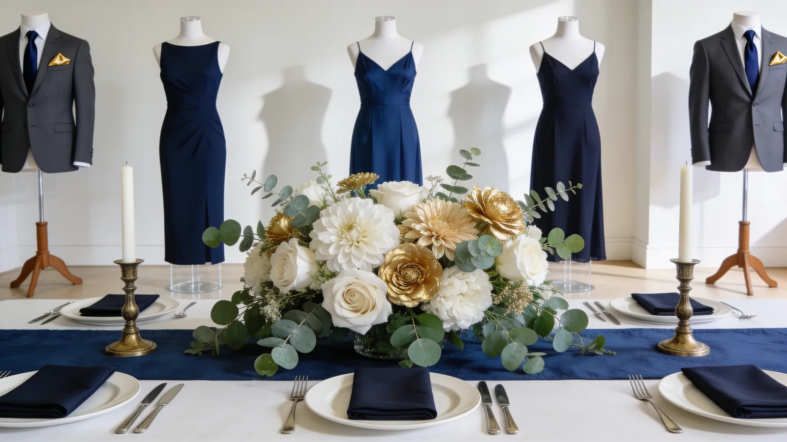
Classic Navy & Ivory
Customize Classic Navy & Ivory in the generator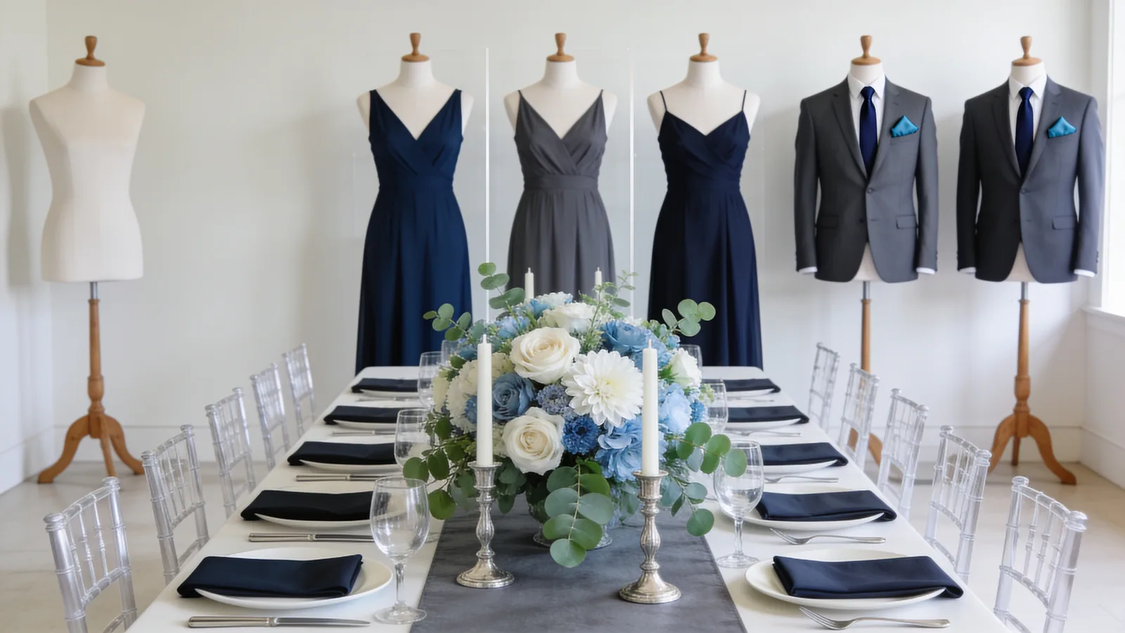
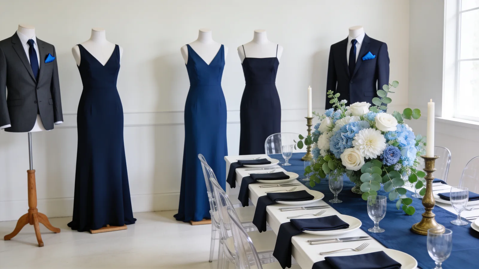
Navy & Silver
Customize Navy & Silver in the generator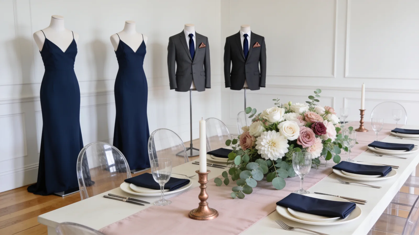
Navy & Blush
Customize Navy & Blush in the generatorSee your wedding aesthetic in 60 seconds
Take the quiz and get a full wedding aesthetic with your palette built in, as a pack of Pinterest-ready visuals.
What colors pair with navy blue
Navy blue pairs with gold and ivory for a timeless formal look, with blush and dusty rose for romance, with burgundy and emerald for a rich jewel-tone wedding, and with silver for a cool winter palette. Gold and silver are both strong metallics with navy.
Navy Blue wedding flowers
Navy wedding flowers come mostly from foliage and dark accents rather than true-blue blooms, which are rare. Think white, blush, and burgundy roses, ranunculus, and thistle, with the navy carried in the suits, linens, and stationery.
Best season for a navy blue wedding
Navy works year-round but is strongest for fall and winter, where it suits formal evening receptions. A navy-and-blush version reads beautifully for spring and summer.
Frequently asked questions
- What colors go with navy blue for a wedding?
- Navy blue goes with gold, ivory, blush, dusty rose, burgundy, emerald, and silver. Gold and ivory make it classic, blush adds romance, and emerald or silver adds depth.
- Is navy blue a good wedding color?
- Yes. Navy is a versatile, formal anchor that suits suits and bridesmaid dresses well, photographs cleanly, and pairs with warm gold, blush, or jewel tones for almost any season.
- What season is best for a navy blue wedding?
- Navy works year-round but is strongest in fall and winter for formal evening weddings. A navy-and-blush palette reads fresh for spring and summer.
- What is the difference between navy and dusty blue?
- Navy is a deep, dark formal blue, while dusty blue is a soft, muted, grayish blue. Navy anchors a palette; dusty blue behaves more like a soft neutral, and the two pair well together.